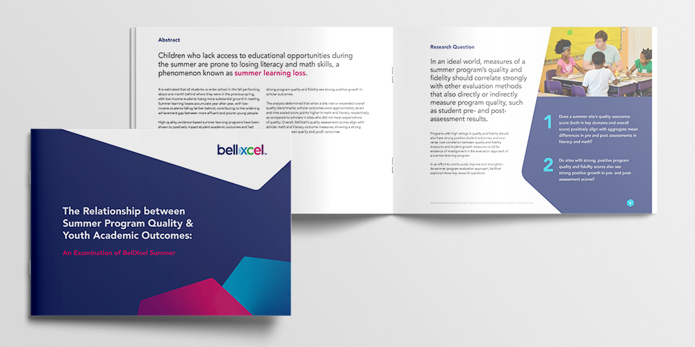
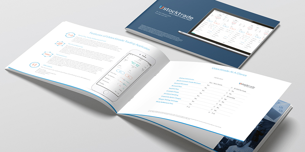
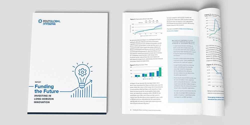
Whitepapers can be powerful tools from both an educational and a marketing standpoint.
But when does it make sense to actually use this tool? And what are the best practices for the creation, structure, and (most importantly in our eyes) design of one? We’ll set out to answer those questions for you here.
What is a whitepaper?
First, let’s make sure we’re all using the term correctly: a whitepaper is basically an in-depth document that explains a position, product, or research. These documents are often filled with informational content including data, facts, and graphs designed to educate–often with the additional goal of complementing the selling process.
Typically, the purpose of a whitepaper is to advocate that a certain position is the best way to go or that a certain solution is best for a particular problem (makes sense when you realize that whitepapers originated in politics). When used for commercial purposes, it can influence the decision-making processes of current and prospective customers.

How do marketers use whitepapers?
Marketers create whitepapers to educate their audience about a particular issue, or explain and promote a particular methodology. They’re advanced problem-solving guides, but they can be used in a variety of ways–sometimes with more of a sales and marketing focus, and other times with a more research and education focused approach.
Often times, organizations will deploy whitepapers as a type of “gated content”. This means they’d be looking to capture leads, requesting at least an email address for download and allowing them to market towards the specific audience that expressed interest in the particular subject.
In some cases, whitepapers may play a rather significant role in a company’s mission. For example, the whitepapers that we’ve helped design for FCLTGlobal are basically the output of months or years of hard work and research. They use whitepapers to convey that research and their learnings, and their constituents have learned to have high expectations of these documents, which are quite rich in content, ideas, and data.
What makes a good whitepaper?
• Length: No fewer than six pages, but can be upwards of 50
• Structure: Title page, table of contents, introduction, explain the problem, offer solutions, and end with a thoughtful conclusion
• Style: Professional, serious, well written

Ways to make whitepaper design engaging
• Use clear page numbers to make it easier to scan content
• Use consistent brand colors and fonts throughout
• Make sure photography represents your target users
• Break up walls of text with visuals like infographics, charts and icons
• Incorporate calls to action throughout
• Allow for plenty of white space
• Switch up your page layouts to keep readers interested

