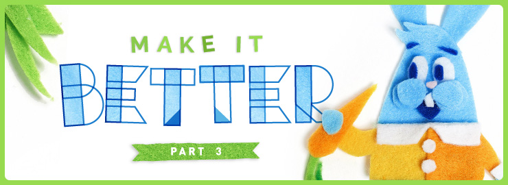
The third part of the series explores dimensions and mediums!
If you didn’t catch my first two “Make it Better” blog posts, check them out here:
• Make it Better – Part 1 →
• Make it Better – Part 2 →
I started this series to share some techniques I find helpful when pushing myself to make my illustration or design solutions “better.”
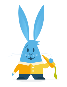
I have a checklist of various properties and ideas that prompt me to think about a project differently. So, with this series, I’m applying these ideas to the concept of “Rabbit & Carrot.” How can I make this concept better and more interesting? What can I modify to better communicate my story or message?
Let’s explore the dimensions
We have a few dimensions at our disposal here — 2D, 3D, and 4D (perhaps there are even more?!). When exploring a design solution, considering all is a necessity. People always interact with a given design through time — the 4D space. How does their interaction unfold from when they first come in contact with a design to when they depart from it? What are the tangible 3D components versus the flat 2D ones, and how do they affect the interaction?
Given that this is a blog post, viewed on a screen, any image I produce will technically appear as a two-dimensional image. That image, however, can be created to emphasize or simulate 2D, 3D, and 4D spaces. Since my only design challenge for this blog post is to enhance our original rabbit and carrot image, let’s explore how each dimension could take the image to another level.
2D
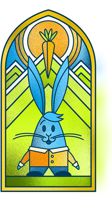
While our original image is already 2-dimensional, we could highlight this fact by giving it a very 2-dimensional context. The first thing that came to my mind was a stained glass window. A window surface is as flat as it gets! Even so, we are still able to add a unique level of depth through how we color the panes.
3D
As you can see in this stained glass window design, I’ve added a window texture to make it appear slightly three-dimensional. This adds a nice touch of texture and depth, but certainly not what I mean by “3D”. For that, we’ll need to explore a different medium.
Mediums!
The number of mediums available to us is only limited by our imagination. Anything can make a mark and become an image! With that in mind, how will the chosen medium affect how your image is viewed? While choosing a medium is often a personal preference, it can be used strategically to communicate something specific as well.
With that last image, “Stained glass” is effectively a medium. With the shapes and composition I chose, the medium almost instantly gives it a religious connotation, alluding to the stained glass windows that adorn many places of worship.
3D, for real this time
I opted for clay as my 3D medium of choice.
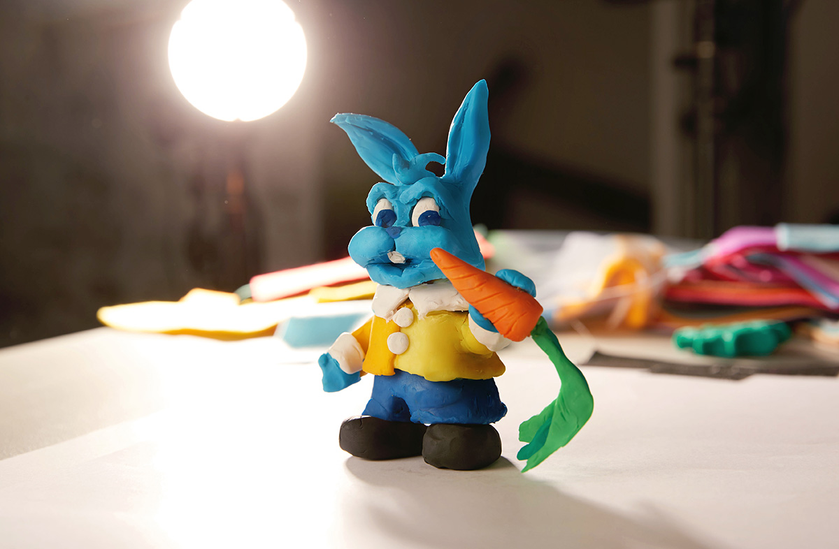
The contrast between this rabbit and the last one is night and day! Bringing him into 3D space gives him a whole lot more weight and presence. In this photo, I decided to leave the background elements in place too, allowing him to inhabit our world. He no longer exists in an abstract pictorial form, but instead is here, with us, in our physical realm. Using clay as a medium instantly reminds me of claymation movies too (I was a big fan of Gumby as a kiddo). Looking at this character, I feel as though he’ll come to life at any moment.
Mixed Mediums and Mixed Dimensions
When considering which mediums to explore, the idea of using felt instantly intrigued me. It seemed to be a fun way to play along the fence between 2D and 3D. The image could essentially be flat, but also, when layered up and photographed, would have a little more texture and depth.
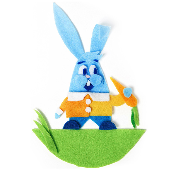
While using essentially the same shapes and colors as our original 2D computer-drawn character, he now has a much different vibe to him. The quirky cuts of the fabric, with the soft texture, make him look rather playful and approachable.
4D
Now, let’s consider giving him a little more life by bringing him into the fourth dimension — with the introduction of time.
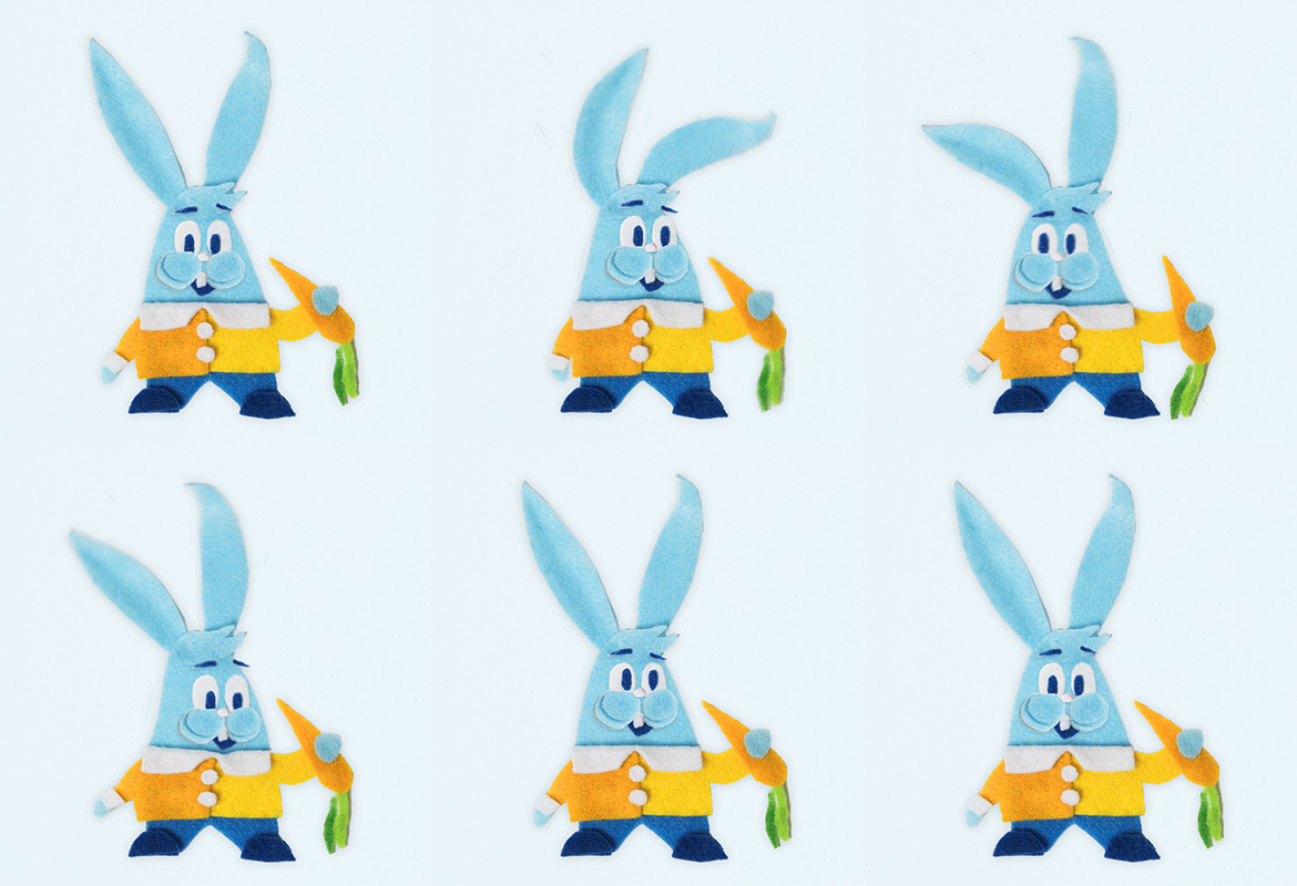
Our felt character already gave us a unique take on the rabbit. Animating him through time suddenly opens up a whole different realm of possibilities. He’s now a moving character, seeming to have a life of his own!
As an illustrator and image creator, I know I have to push myself to make something unique that will stand out from the ordinary. Mixing mediums and exploring dimensions can unlock something unique and special. Hopefully, the result will get the viewer to pause and consider the image a little longer — making it that much better.
MY “MAKE IT BETTER” CHECKLIST
Click on the link below to explore other elements explored in the series:
- Size
- Color
- Shape
- Pattern
- Lighting
- Texture
- 2d? 3d? 4d?
- Medium?
- Mix mediums?
- Style
- Variety
- Similarity
- New element
- Proportions?
- Abstract? More literal?
- Inverted?
- Simpler?
- Geometry/symmetry?
- Organic/fluid
- Motion
- Foreground/background
- Layers
- Transcendant / grander
- Visceral reaction
- Sound
- Taste
- Smell
- Time – past/future
- Anticipation / relief
- Energy
- Excitement
- Connections / relationships
- Expected vs unexpected
- Yes, and…
- Next level
- Coincidences
- Universality
- What universe?
- Audience, personalities
- Different vs familiar
- Amount of
- Nature
- Look-alikes
- Mask/crop/ knock out
- Isolate it, place it
- Allude to it (just enough)
- Split it apart
- Off the page
- Combine, merge
- Depth, angles (not straight-on view)
- Mix it up
Stay tuned for part 4, where I’ll explore three more properties on my list. And hopefully make for a better image!
