The fourth part of the series explores style!
If you didn’t catch my first three “Make it Better” blog posts, check them out here:
• Make it Better – Part 1 →
• Make it Better – Part 2 →
• Make it Better – Part 3 →
I started this series to share some techniques I find helpful when pushing myself to make my illustration or design solutions “better.”
I have a checklist of various properties and ideas that prompt me to think about a project differently. So, with this series, I’m applying these ideas to the concept of “Rabbit & Carrot.” How can I make this concept better and more interesting? What can I modify to better communicate my story or message?
Let’s explore style!
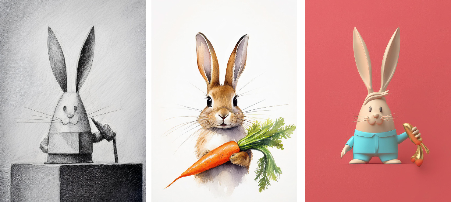
The visual style defines the overall look of the image. Styles can vary widely as there are an infinite number of ways to create an image. Each artist has their own manner of making an image that is reflective of their personality, dictated by a history of experiences unique only to them. With endless possibilities, my first attempt at narrowing this exploration is to focus on the medium.
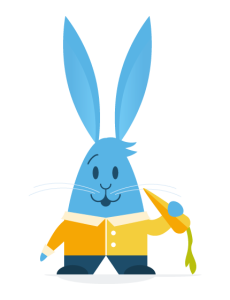
Style influences the medium used and vice versa. In my case, my original medium was the computer. I used flat geometric and graphic vector shapes created in Adobe Illustrator. That stylistic approach was very indicative of my personal art style at the time when I was getting comfortable using the computer as a drawing medium and enjoying the use of strong geometric shapes. I was also interested in creating illustrations quickly and practically. Creating vector art on the computer was fast and straightforward, which was also helpful in starting this blog post.
As much as I enjoy the shapes of this visual style, this approach can feel a bit lacking in warmth. We miss out on the element of that human touch that is seen in more traditional mediums like painting, pencil, charcoal, watercolor, etc. There’s a liveliness and energy in a work of art where we see the brush strokes, the texture, the evidence of the human hand at work. For that reason alone, digital tools have now become extremely sophisticated in recreating the look of traditional media. Digital brushes in Photoshop and Procreate match their analog counterparts in ways that seem nearly identical when viewed on a screen. This gives digital artists the ability to explore what they like about the look of traditional techniques while maintaining the time-saving benefits of digital creation as well.
A.I. has entered the chat
Since starting this blog series, another digital tool has taken off in popularity, accessibility, and sheer capability—Generative Artificial Intelligence. Generating an image that matches any number of styles has never been easier.
To speed up my exploration of visual styles for this post, I decided to use Adobe’s generative AI tool Firefly.
Generating images with Firefly is as simple as writing a text prompt and selecting various art styles from a menu. So, I gave it a go, supplying my original vector art as a reference for the image’s structure. And the results were pretty interesting!
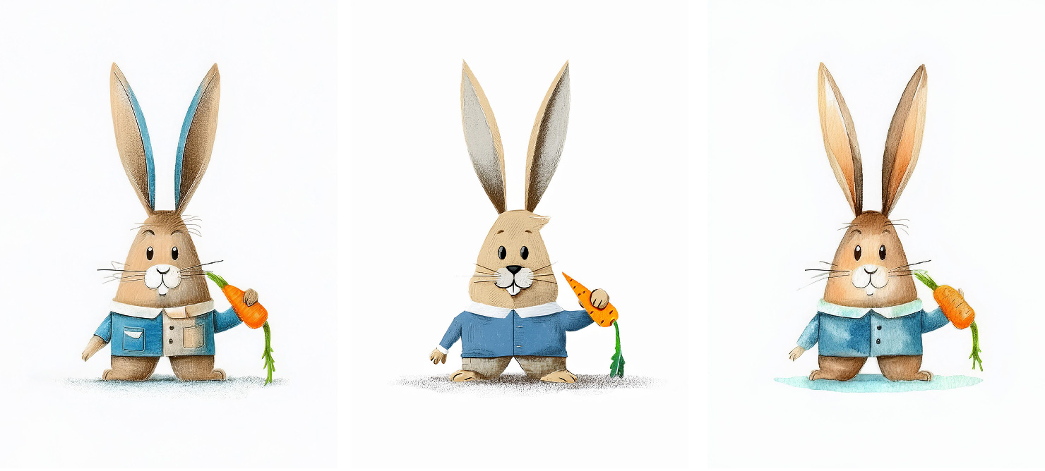
Here, we have the AI model’s interpretation of drawing, colored pencil, and watercolor, which all add a bit of warmth and life to the image.
Further explorations give the character a more expressive face, which is great. The style however looks a bit dated or generic, which tends to be an issue with AI-generated images. At first glance, these seem like a nice style for a children’s book, but are not unique enough to stand out among today’s contemporary kids’ book artists.
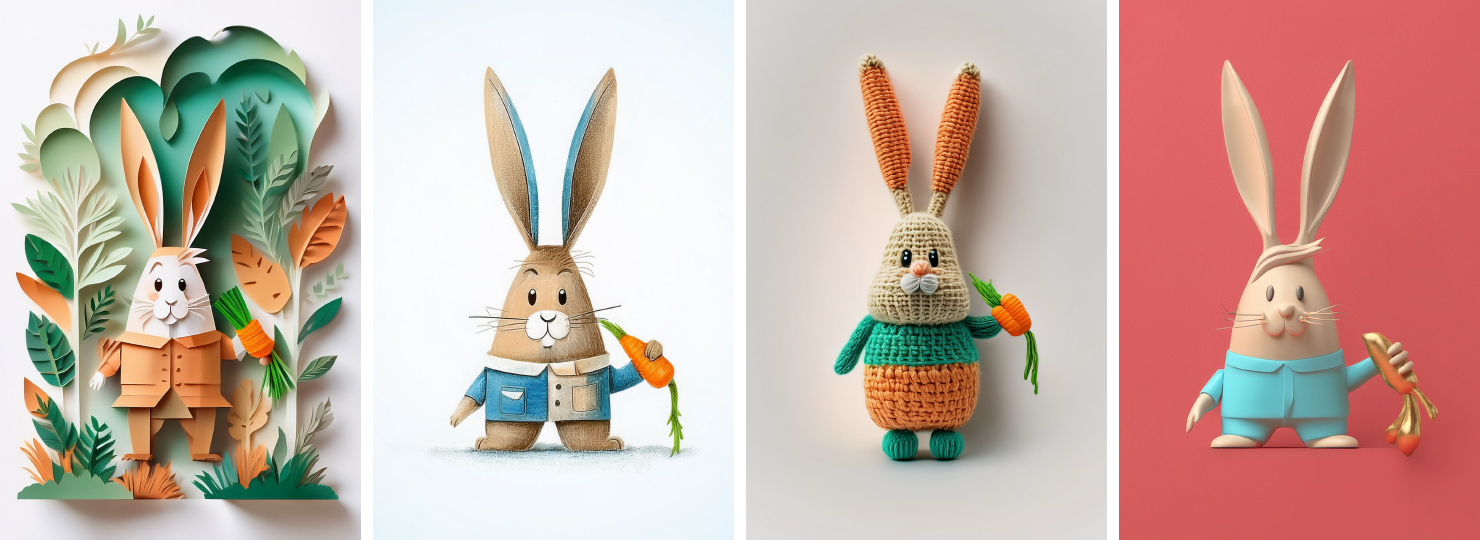
More interesting to me are the styles that deviate further from the original image.
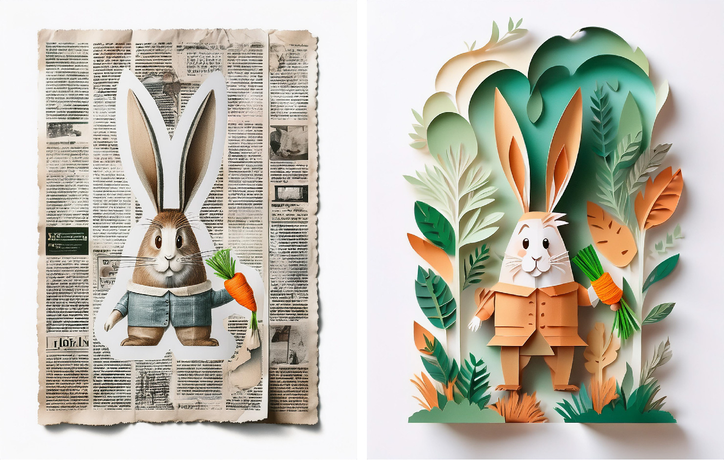
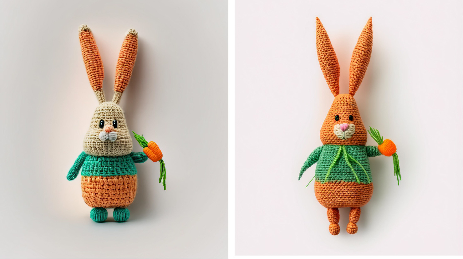
These paper cutout styles are super fun with the added texture and dimension. The show-stopping images for me though were the knitted dolls, which I found to be incredibly charming:
Of course, the irony of using a computer to help give my art a “human touch” is not lost on me. The benefit of being able to rapidly experiment though was worth it. It gave me a quick sneak peek into where I could take the art and how I’d feel about exploring that style. These styles can be really time-consuming, as I learned with my clay creation from my last blog post.
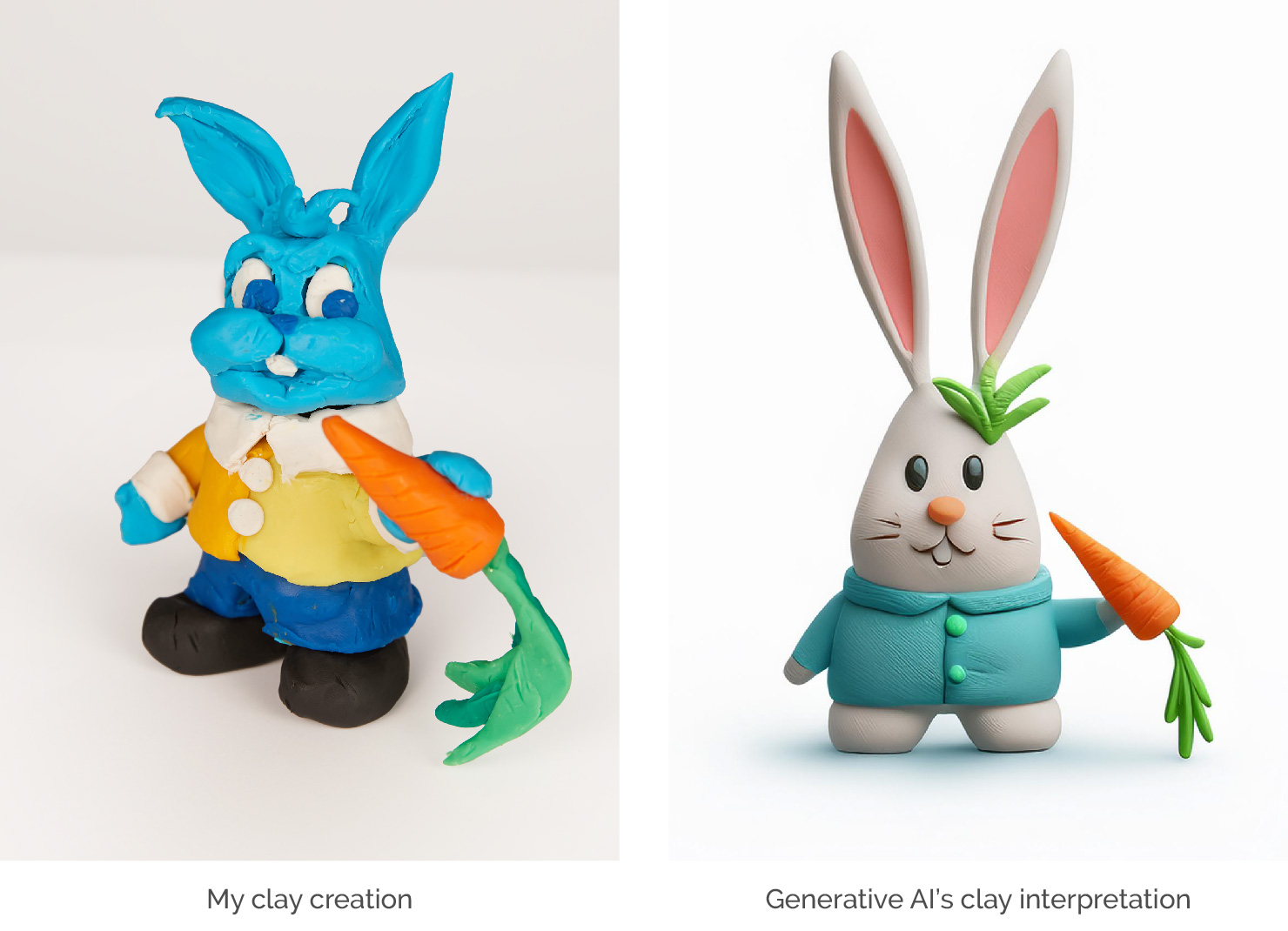
I’ve gotta say, AI has me beat here. Its interpretation is just so smooth and it has that cute factor.
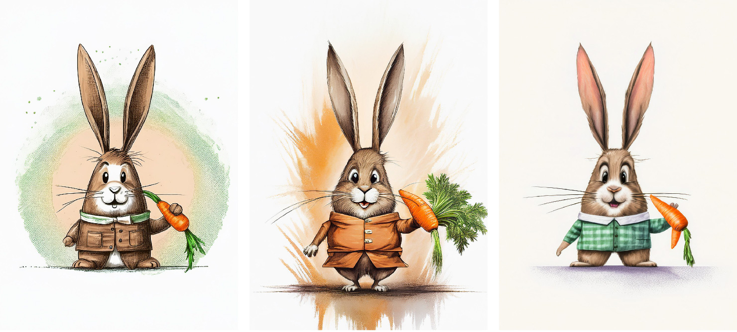
While clay may not be my medium, vector art is. I was curious if Firefly could match my personal style if it referenced another image so I uploaded this rabbit self-portrait I created a while back.
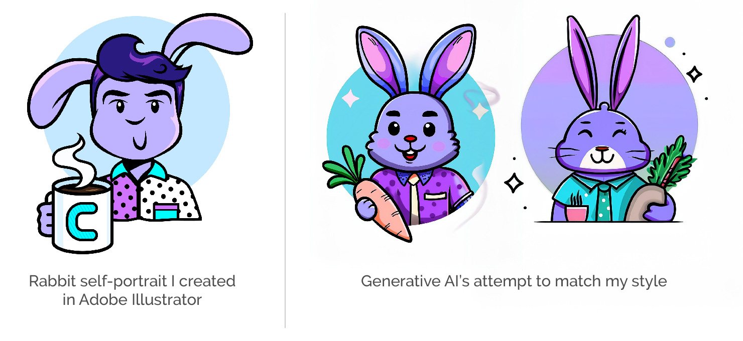
The results are fairly solid though they do feel a touch generic or dated to me. In defining what makes an image “better,” consider that nothing exists in a vacuum. Popular styles and trends are ever-evolving. Being able to put a unique spin on it that moves away from the realm of generic is crucial in standing out. Recognizing where a specific style is appropriate is also key as different audiences will respond differently to different art styles.
Style really is infinite.
MY “MAKE IT BETTER” CHECKLIST
Click on the link below to explore other elements explored in the series:
- Size
- Color
- Shape
- Pattern
- Lighting
- Texture
- 2d? 3d? 4d?
- Medium?
- Mix mediums?
- Style
- Variety
- Similarity
- New element
- Proportions?
- Abstract? More literal?
- Inverted?
- Simpler?
- Geometry/symmetry?
- Organic/fluid
- Motion
- Foreground/background
- Layers
- Transcendant / grander
- Visceral reaction
- Sound
- Taste
- Smell
- Time – past/future
- Anticipation / relief
- Energy
- Excitement
- Connections / relationships
- Expected vs unexpected
- Yes, and…
- Next level
- Coincidences
- Universality
- What universe?
- Audience, personalities
- Different vs familiar
- Amount of
- Nature
- Look-alikes
- Mask/crop/ knock out
- Isolate it, place it
- Allude to it (just enough)
- Split it apart
- Off the page
- Combine, merge
- Depth, angles (not straight-on view)
- Mix it up
Stay tuned for part 5, where I’ll explore other properties on my list. And hopefully make for a better image!