A brand style guide is a vital document for your company to communicate consistent visuals and messaging to your audience.
Your brand style guide defines your company’s brand strategy and elements on how they should be applied across marketing materials. It can go as far as to address the type of photography style that should be used, state the distance a logo should be from an edge, dictate how copy should be written, and even communicate how signage and furniture should look in a real-world environment.
Being able to help direct your company’s self-presentation in a single document makes it easier for anyone within your company, whether it be designers (internal and external), freelancers, contract workers, or outside vendors (i.e. printers), to communicate the brand to your audience in a consistent manner.
What does a brand style guide look like?
Brand style guides are commonly put together as a PDF document. The length of the document can vary depending on how much content you have and how specific you need your style guide to be. For larger companies, a longer, more detailed style guide may be needed to fully encompass all of the branding elements and messaging involved. For smaller companies, a simple one-page logo style guide may be all that is needed.
The common components of a brand style guide
LOGO
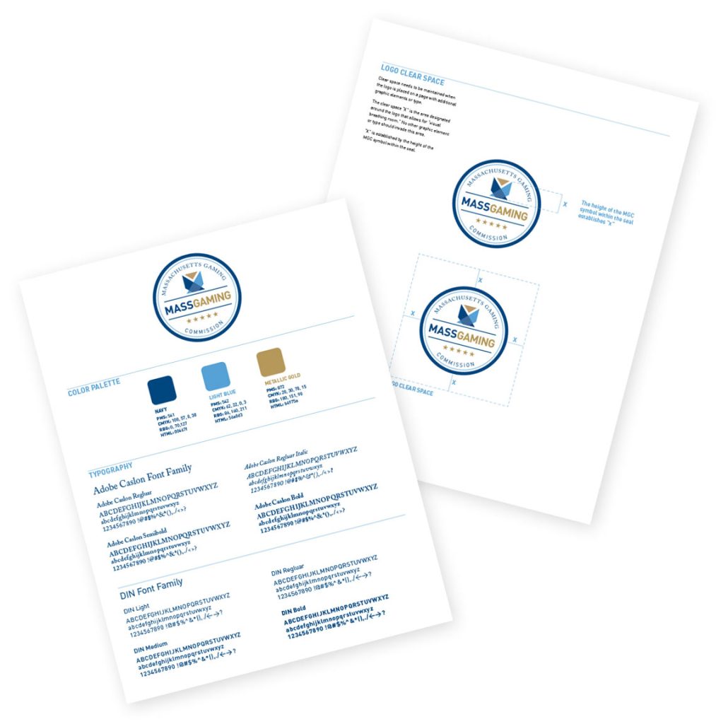
At a minimum, your company should have a brand design guide for your logo(s). This guide shows any of the primary and secondary logos that your company uses, along with color formats in Pantone, CMYK (for print), RGB (for screens), and hex codes (for web). This is extremely useful for designers, web developers, and printers in maintaining how the logo should look across all mediums.
- Primary logo
- Any secondary logos or monograms
- Sizing (minimum size, size in relation to other elements)
- Placement
- Spacing
- Examples showing how not to use the logos
COLORS
Colors require different values and settings on various printing processes and devices. Letting software convert colors for you is not always the best option, so be sure to have a specified value for each usage.
- Primary/secondary/tertiary colors
- Limited/single-color versions of the logo
- Pantone
- CMYK
- RGB
- Hex
TYPEFACES
Typefaces come in multiple weights and styles and can be manipulated in different ways (e.g. uppercase/lowercase, bold, italics), which can affect the feel of your marketing materials. Defining how and which typefaces are used is another way to define how your company’s materials look.
- Names of any primary/secondary typefaces used in the logo, marketing material, and on the web
- Examples showing the different weights used
- Descriptions of how elements, such as titles or body copy, should be styled (i.e. bold, all-caps for titles, regular weight, and sentence-casing for body copy)
- In some cases, typefaces you use in one medium may not be usable or ideal for legibility in another (such as print versus web). Listing out alternative web-safe fonts may be useful as well.
WEB STYLES
Websites often have dozens or hundreds of pages. It may be worthwhile to define how certain elements on the web should be styled so that developers can keep these elements the same across all pages.
- Buttons
- Form elements
- Iconography
OTHER COMPONENTS
Brand style guides can be as in-depth as you need them to be and can help give users an insight into the more subjective aspects of your company.
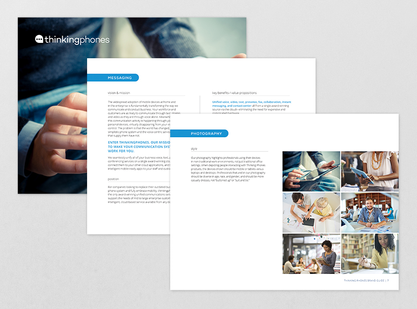
- Brand history, values, vision, personality, and manifesto
- Copywriting style (e.g. keywords, words to avoid, tone of the writing)
- Photography style (e.g. lighting, composition)
EXAMPLE MATERIAL
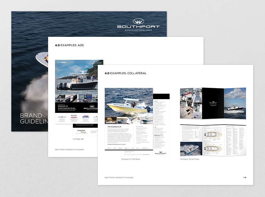
Examples and guidelines of common marketing materials such as business cards, letterheads, brochures, and pocket folders are useful to include as a reference.
Example Guides
BRAND STYLE GUIDES
The guides we have created for our clients below show a few sections that go beyond the usual scope of a brand style guide.


LOGO SHEETS
These logo sheets are a quick reference for clients that may not need a full set of guidelines. Even though these sheets are brief, they contain useful information for designers and printers.

Conclusion
There are so many types of media that your company may be involved with online and offline in today’s world. A brand style guide is important for any company in helping keep visuals and messaging consistent across all platforms of communication with their audience. This explains the high value placed upon investing the time and effort into having a document that makes it easy for everyone to work with your brand and its assets.
Learn more about how Jackrabbit can help with brand identity.
