I have a great appreciation for the history of graphic design; I find that exploring designs of the past is a worthwhile endeavor for gaining inspiration and feeding my creativity for making informed and inspired new design solutions. Vintage ads are of special interest to me because there is so much to be discovered in them about the history of typography, design, and printing methods. By inspecting them closely, you can gain a new perspective on design — whether it is through small discoveries or through connecting the dots of key milestones in design history.
Print ads are a form of ephemera, which are a unique classification of short-lived printed items, used in daily life but not meant for people to save or preserve. Interestingly, when a piece of ephemeron is preserved, it can be a valuable source of historical information about the time period in which it was created. Some of the world’s largest libraries and museums collect, organize, and preserve ephemera as part of history.
I would like to share with you a small collection of mine. These are vintage trade journals published in the year 1877, given to me by a friend who worked for a publishing company. The pages are chock-full of old advertisements with unique typography and wonderfully detailed artwork created to sell jewelry, watches, clocks, and silverware. The collection consists of 12 issues of The Jeweler’s Circular & Horological Review, a publication established in 1869. Today it is known as the Jeweler’s Circular Keystone or JCK and it remains the jewelry industry’s leading trade publication and industry authority.
Take a look at some of my favorite specimens below.
I hope you enjoy these as much as I do!
The interesting mix of typography shown here fascinates me. These vintage ads were published in 1877, on the heels of the Industrial Revolution which brought notable changes to printing and typography in the 19th century. The mass production of consumer goods demanded a new kind of print communication to assist in selling products to people of the growing cities. This new form of print media exploded and advertisements were published in magazines, newspapers, and trade journals. The growth of advertising demanded type styles that were bold and distinctive enough to capture the reader’s attention. By the end of the 19th century, typography had expanded to include a variety of slab serif or workhorse fonts as well as overly ornate display fonts influenced by the Victorian era. The experimentation in the combination of these fonts can be seen in these vintage ads. Enjoy!
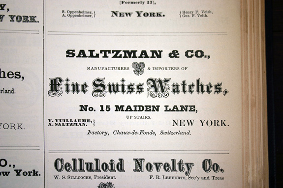
Saltzman & Co., Manufacturers & Importers of Fine Swiss Watches, New York
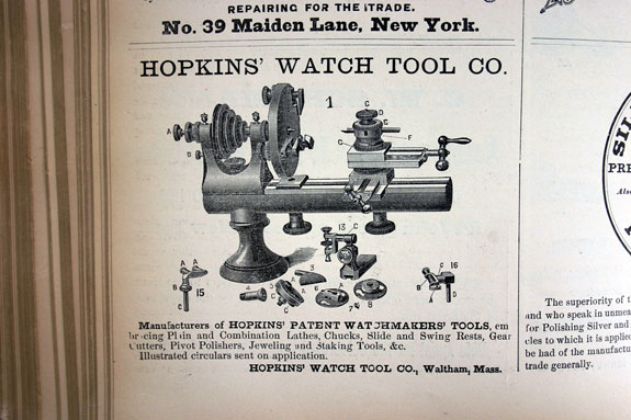
Hopkins’ Watch Tool Co., Waltham, Mass.
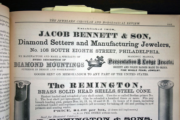
Jacob Bennett & Son, Diamond Setters & Manufacturing Jewelers, Philadelphia, Established in 1828
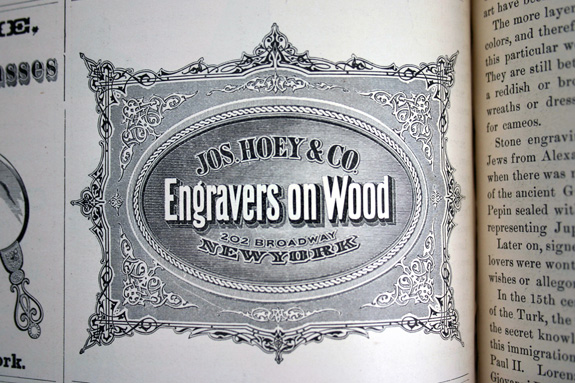
Joseph Hoey & Co., Engravers on Wood, New York
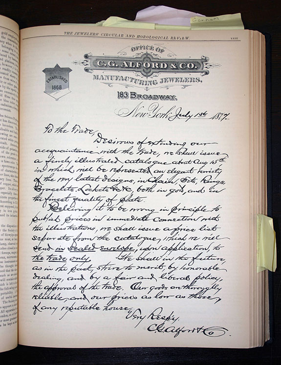
Full-page Letter dated July 1, 1877, from the Office of C.G. Alford & Co., New York, Established 1868
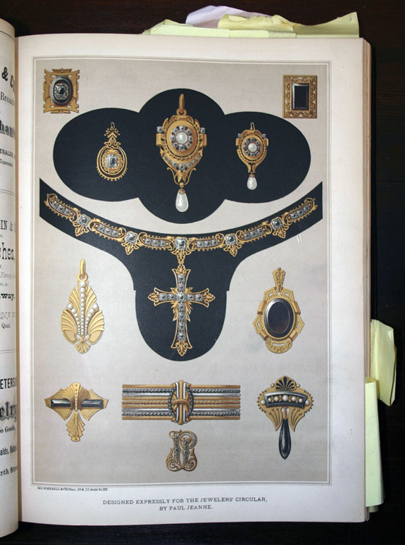
Full-page jewelry illustration printed in metallic gold ink. Credits listed: Designed expressly for the Jewelers’ Circular, by Paul Jeanne. Printed by George W. Averell (steam lithographic & letterpress printer) 20 &22 Gold Street, New York
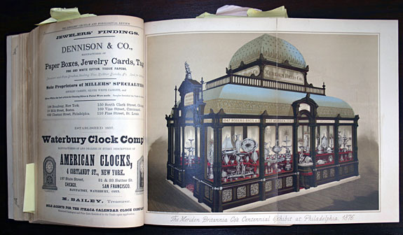
Special fold-out illustration printed in metallic gold and silver inks. The Meriden Britannia Co’s. Centennial Exhibit at Philadelphia, 1876. Credits listed: Printed by George W. Averell (steam lithographic & letterpress printer) 20 & 22 Gold Street, New York
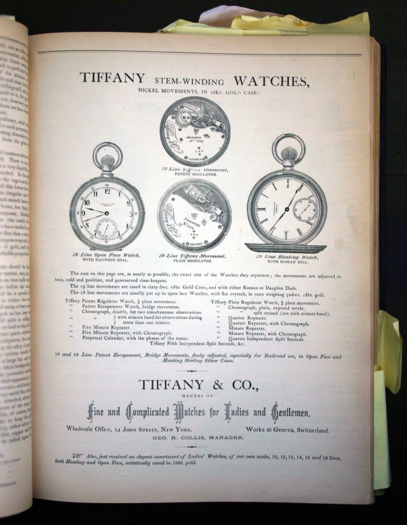
Full page Ad: Tiffany & Co., Makers of Fine & Complicated Watches for Ladies and Gentlemen, New York
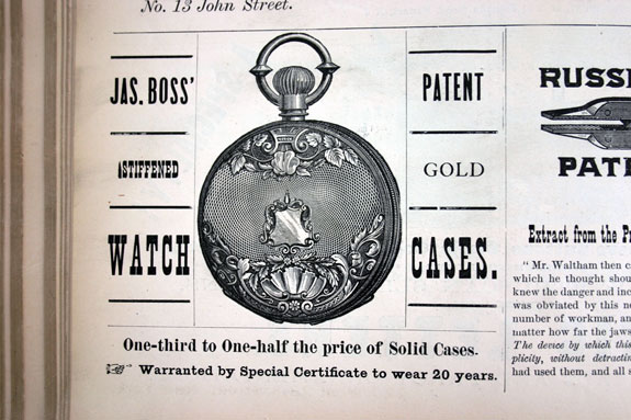
Jas. Boss’ patent stiffened gold watch cases
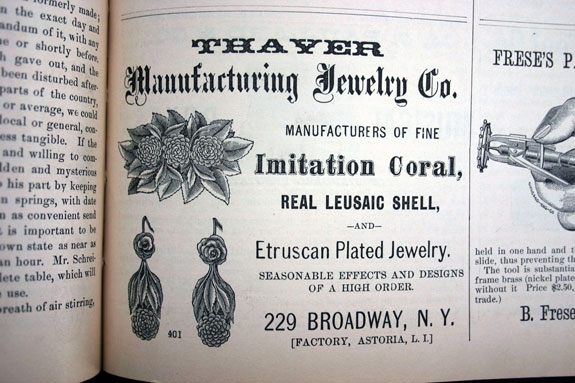
Thayer Manufacturing Jewelry Co., Manufacturers of Fine Imitation Coral, Real Leusaic Shell, and Etruscan Plated Jewelry, New York
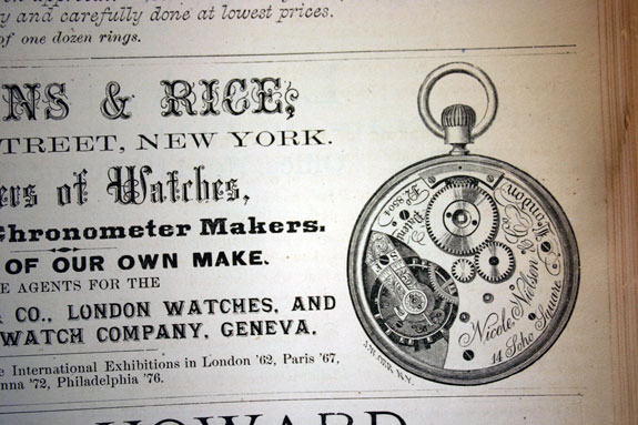
Watch illustration from an ad for Bartens & Rice, Importers of Watches, Watch and Chronometer Makers, Sole agents for Nicole Nielsen & Co, London watches. Medals and Diplomas at the International Exhibitions in London 1862, Paris 1867, Vienna 1872, Philadelphia 1876.
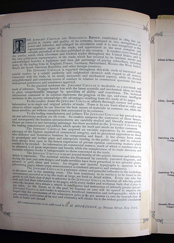
An interesting page that describes the importance of The Jewelers’ Circular and Horological Review, Established in 1869. Published by D. H. Hopkinson, 42 Nassau Street, New York
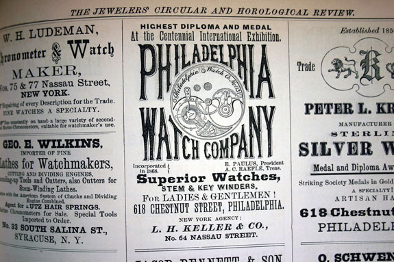
Philadelphia Watch Company, Inc. 1868, Superior Watches, Stem & Key Winders for Ladies & Gentlemen. Highest Diploma and Medal at the Centennial International Exhibition.
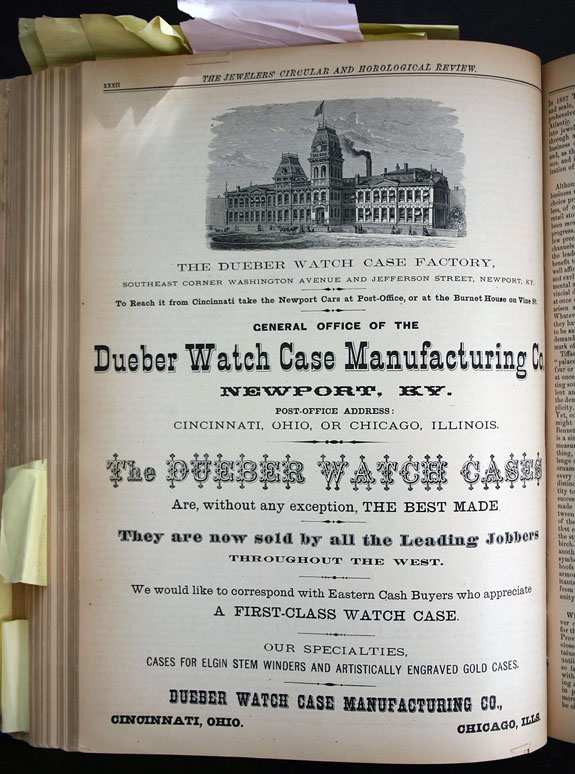
Full page Ad: Dueber Watch Case Manufacturing Co., Newport KY
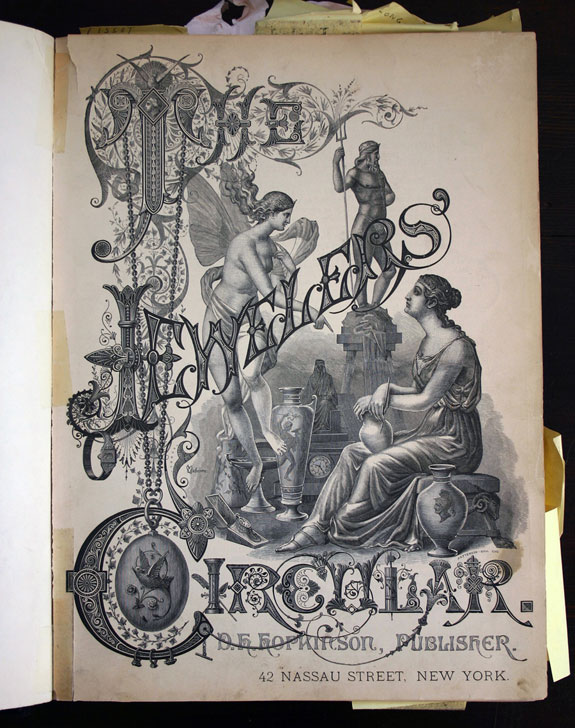
Cover Artwork: The Jewelers’ Circular, Volume VIII published in 1877 by D.H. Hopkinson, New York. Credits are listed for Charles Osborne (silver designer) and Patterson & Son (yellowware pottery designer).
For more inspiration on the subject of printed ephemera, check out these websites:
Library of Congress, The Printed Ephemera Collection
University of Oxford, John Johnson Collection of Printed Ephemera
